Logos are like outfits for brands. The right one makes you stand out. The wrong one? It gets forgotten. Every year, new logo trends rise while others fade. As we move into 2025, it’s time to freshen up, get inspired, and maybe clean out the logo closet.
TL;DR — Your Quick Style Guide for 2025 Logos
Logo trends in 2025 are all about balance. Minimalism is still hot, but now it comes with personality. Nostalgia is back (hello, Y2K!) and bold fonts are making noise. But say goodbye to overused gradients and complex animations.
1. Still Cool: Minimalism with Personality
Minimal logos still rule, but now they have more character. Clean lines + clever details = memorable logos. Think simple symbols that tell a story or use negative space in smart ways.
Keep: Flat designs, clean icons, and smart whitespace.
Drop: Ultra-boring minimalist logos that say nothing.
2. Making Noise: Bold, Experimental Typography
Text-based logos are getting louder. Expect to see stretched fonts, squished letters, and playful kerning. These logos scream confidence—and they’re not afraid to take up space.
Keep: Custom fonts, attention-grabbing spacing.
Drop: Overused standard fonts with zero flair.
3. Out of Time: Y2K & Retro Nostalgia
The early 2000s are back! Think chrome effects, bubbly fonts, and old-school video game vibes. People love the warm, fuzzy feeling of nostalgia, and brands are catching on.
Keep: Playful callbacks to past decades.
Drop: Trying too hard to re-create the past without a modern twist.
4. Eco-Friendly Looks: Earthy Colors & Organic Shapes
Green is more than just a color—it’s a brand message. In 2025, eco-conscious companies are using soft palettes, hand-drawn lines, and natural textures to reflect sustainability.
Keep: Muted greens, browns, and flowing forms.
Drop: Overly polished images that feel artificial.
5. Animated Logos (But Chill)
Motion is great—but not if it gives people a headache. This year, logo animations are subtle and purposeful. A gentle fade, wiggle, or rotation can add life without being distracting.
Keep: Light, clean animation for digital platforms.
Drop: Over-complicated transitions and long animations that take forever to load.
6. Geometric Simplification
Shapes speak louder than words. Circles, triangles, and squares are forming the foundation of modern, memorable logos. It’s all about structure and balance.
Keep: Clear, symmetrical logos that look good anywhere.
Drop: Unbalanced shapes and overly abstract icons.
7. Gradient Glow-Up
Gradients aren’t gone, but they’ve grown up. In 2025, we’re seeing smoother transitions and tasteful color blends. No more rainbow explosions—think sunset vibes and soft lights.
Keep: Elegant two-tone gradients.
Drop: Harsh, neon, multi-color mashups.
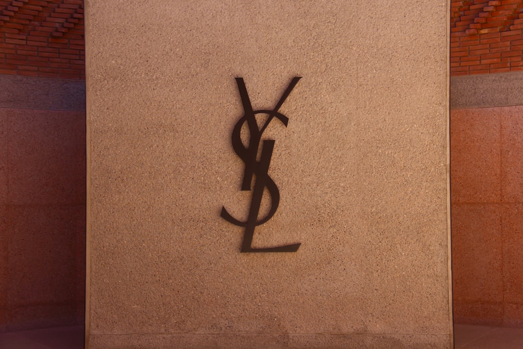
8. Monogram Mania
Monograms are back—but smarter. Brands are using initials in creative, stylish ways. It’s perfect for personal branding and startups who want to look premium.
Keep: Clever letter merging and symmetry.
Drop: Monograms so tangled you can’t tell what they say.
9. Hand-Crafted Vibes
Imperfect is the new perfect. Hand-drawn lines, sketchy fonts, and brushstroke effects show authenticity. Especially for indie brands, this style builds trust.
Keep: Human touch, raw textures.
Drop: Over-digitized “handwriting” that looks fake.
10. Typography-Driven Logos
Sometimes, words are enough. In 2025, more brands are ditching icons and leaning into strong, custom lettering. It’s bold, direct, and easy to remember.
Keep: Wordmarks that stand out on their own.
Drop: Icon overload and mixing too many font styles.
11. Negative Space Magic
Everyone loves a little visual trickery. Designers are mastering the art of sneaking extra meaning into their logos using empty space. It’s clever—and unforgettable.
Keep: Smart use of shape and silhouette.
Drop: Visual confusion just for the sake of being different.
12. Layered Effects & Semi-Transparency
Depth is in. Overlapping shapes, transparent elements, and color overlays can create dimension while staying clean. This trend works great in both digital and print.
Keep: Layered looks that add context and clarity.
Drop: Busy visuals and chaotic stacks.
13. Adaptive Logos for Every Screen
One logo doesn’t fit all anymore. Smart brands in 2025 will use scalable, responsive logos that look great on everything—from tiny app icons to giant billboards.
Keep: Logo systems with different sizes and layouts.
Drop: Fixed formats that don’t flex with screen sizes.
Wrapping It Up: 2025 Logo Cheat Sheet
- Yes, please: Minimalism with character, bold fonts, nostalgia, natural vibes, motion, geometric simplicity, clever use of space.
- No, thank you: Overused effects, confusing icons, ultra-busy designs, logos that don’t scale.
Logos aren’t just pretty pictures—they’re the face of your brand. In 2025, it’s all about clean confidence, emotional connection, and flexibility. Whether you’re redesigning or just refreshing, these trends should guide your creative journey.
Have fun with it. Be bold. Be clever. And always—always—keep it timeless.