Creating logos for children’s brands and toy companies is one of the most imaginative and rewarding areas of design, but it also presents unique challenges. Unlike corporate or luxury branding, children’s brand logos must appeal to both kids and their parents, reflect playfulness while ensuring safety and trust, and remain flexible enough to serve as a basis for storytelling across multiple platforms. Whether designing a logo for a toy startup or rebranding an established children’s product line, it’s essential to tap into design strategies that resonate with young audiences and build confidence with adult buyers.
TL;DR
Designing logos for children’s brands requires a delicate blend of creativity, trustworthiness, and approachability. The most effective logos combine bold colors, simple shapes, and emotionally engaging themes to connect with both kids and parents. This article explores nine proven logo concepts that resonate across the children’s toy and brand space, offering inspiration and strategic insight. Each concept is grounded in best practices for color psychology, brand messaging, and age-appropriate visual storytelling.
1. The Friendly Mascot
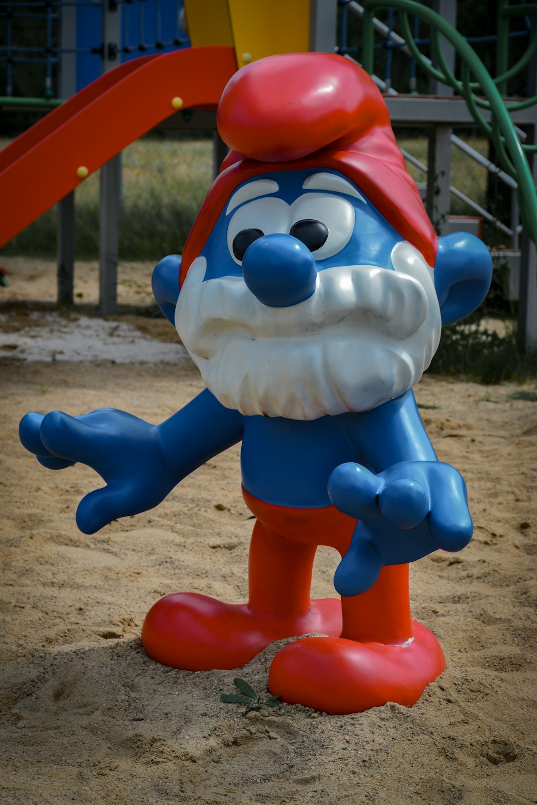
One of the most beloved and effective logo styles in the children’s market is the use of a cute, friendly mascot. This anthropomorphic figure acts as a stand-in for the brand’s personality and can help bridge emotional connections between kids and products. Think of iconic figures like the Pillsbury Doughboy, Lego mini-figures, or even Thomas the Tank Engine.
- Why it works: Kids are naturally drawn to characters they can relate to.
- Best for: Toy lines that feature collectibility or storytelling elements.
- Design tip: Keep lines simple and expressions exaggerated for easy recognition.

2. Bold Typography with Personality
Typography doesn’t have to be plain—it can be playful, bouncy, and full of life. Using stylized text as the centerpiece of a logo is effective in both physical and digital applications, especially when the brand name itself is rhythmic, short, or onomatopoeic.
- Why it works: Typography becomes part of the character of the brand, enhancing memorability.
- Best for: Brands marketed through television or videos where the logo becomes part of an opening sequence.
- Design tip: Explore rounded letterforms, soft shadows, and bubble styles for a kid-friendly tone.
3. Color-Heavy Palette Design
Color plays a pivotal role in children’s logo development. Primary colors (red, yellow, blue) and pastel tones often spark recognition and are age-appropriate for most young demographics. Each color also evokes a mood — blue for trust, yellow for joy, red for excitement.
- Why it works: Kids are visually stimulated by bright, high-contrast colors, which also promote faster brand recognition.
- Best for: Educational toys, games, and preschool-focused materials.
- Design tip: Use 2–3 core colors to ensure the logo remains versatile across packaging and digital screens.
4. Whimsical Illustrations
Hand-drawn or digitally rendered illustrations can convey a handcrafted, human touch that appeals to parent buyers while engaging children through storytelling. Whimsical illustrations often suggest creativity, imagination, and artistic freedom.
- Why it works: These logos feel personal and less corporate, helping establish emotional trust.
- Best for: Art-based toys, apparel, eco-friendly brands, or boutique children’s products.
- Design tip: Embrace imperfect lines, storybook-style illustrations, and symbolic animals or nature elements.

5. Geometric Simplicity
Sometimes the key to a memorable children’s brand is clarity. Geometric logos—featuring squares, triangles, circles—offer clear shapes that are easy for growing brains to interpret. They’re particularly useful for early learning centers, STEM toys, or educational games.
- Why it works: Predictable shapes help children feel secure and reinforce pattern recognition.
- Best for: Cognitive development or tech-focused toys for ages 3–8.
- Design tip: Use soft-edged geometry for a friendly aesthetic and avoid sharp, angular lines.
6. Nature-Inspired Motifs
Incorporating elements from nature—trees, animals, stars, rainbows—can signal innocence, sustainability, and creativity. These motifs are especially relevant for parents increasingly concerned with environmental responsibility and sensory development.
- Why it works: Nature signals health and emotional well-being while subtly differentiating the brand from tech-heavy competitors.
- Best for: Wooden toys, educational kits, clothing, and storybooks.
- Design tip: Use earthy tones with splashes of vibrant highlights to convey vibrancy without overwhelming.
7. Nostalgic Aesthetics
Design isn’t always about looking forward—some of the most successful children’s brands evoke the past. Retro color palettes, vintage illustrations, or playful nods to mid-century packaging can trigger nostalgia in parents while still charming kids with friendly visuals.
- Why it works: A cross-generational appeal builds emotional value and trust with buyers.
- Best for: Classic-style toys, puzzles, or heritage collections.
- Design tip: Pair serif fonts with vintage illustrations for authentic throwback appeal.
8. Interactive or Modular Logos
Transformational logos evolve by season, product line, or interface, adapting across digital platforms like apps and games. Kids love surprises and motion, making animated or reconfigurable logos a compelling design direction.
- Why it works: It encourages brand interaction and creates a dynamic identity kids want to explore.
- Best for: Digital-first children’s games, apps, or even toy brands that cross multiple media channels.
- Design tip: Develop a base logo that can transform with themes, holidays, or in product packaging.

9. Textured & Tactile Logos
Though most logos are flat by necessity, particularly for digital formats, designing with a tactile intention can inspire affinity in packaging and product labeling. Logos that look like felt, crayon art, sponge prints, or building blocks evoke multisensory play.
- Why it works: Kids are hands-on learners; visualizing texture stimulates memory and creativity.
- Best for: DIY kits, creative play sets, and any toys marketed through physical, sensory-rich experiences.
- Design tip: Simulate textures digitally or incorporate 3D features in packaging.
Final Thoughts
Designing engaging logos for children’s products is a serious and strategic endeavor, requiring a robust understanding of developmental psychology, color theory, and emotional messaging. While whimsy and fun are central to the children’s brand universe, the best logos go further—encapsulating core values such as safety, creativity, trust, and learning. By applying the above nine concepts, designers and brand managers can build identities that don’t just grab attention—but foster lasting affection and trust from both children and adults.
Remember: Your logo is often the very first impression a child or parent will have of your brand. Make it count by choosing a design path that aligns with the spirit, values, and audience of your product.


